Friday, December 4, 2009

Bullying poster

The third one is the best poster becasue the text stands out more then the other three, and because its very important to understand. Also i put the website in it so then people who get bullied can go to the website and get help. The poster also makes people think and makes people realize that names can actually hurt people and its true. The picture also shows the two girls in the back that are bullying the one girl because they have thier hands over their mouths and it looks like they are talking shit about her. the white colour on the text that says "Or will they" stands out on the blue backround. I like the third one also because the words are not all cluttered in one place.

Bullying!!!

The topic we chose for my poster is bullying. Bullying is when a person is picked on over and over again by an individual or group with more power, either in terms of physical strength or social standing. “Sticks and stones may break my bones, but names will never hurt me”. This is a quote but it’s not really true because name calling can hurt people. Teenage girls are afraid to go to school because they are scared they are going to get bullied. Girls get bullied often by other girls. Bullies often pick on people they are jealous of, girls who don’t fight back, People who seem “different” from themselves or their friends, Teens who may be “richer” or “poorer” than the bully or girls with disabilities. These are many reasons why girls bully other girls. This is why we picked this topic because it is a big issue in many schools. sunnie25 :)

Thursday, November 26, 2009

Get creative with your video camera

  • To get creative with your video camera get on your knees or climb a tree. Take the viewer to a place they wouldn’t normally go. The ground also serves as a decent tripod. Shooting high will give you a good shot that you know you need.
  • Don’t just shoot a tight shot. Instead, go super tight–as tight as your lens can focus tight. These shots are great because they are as visually jarring as they are visually interesting. They also make for excellent transitions between scenes.
  • Look for that subject perspective shot. An example of this would be a shot following the feet of a mailman trudging through snow, or following a toddler around from their low perspective.
  • Let the action leave or enter your frame. When you do this it allows you to compress time in your video. You can quickly transition to a different scene after the subject leaves the frame.
  • You can also turn off your autofocus and try a manual shift-focus shot. Try starting with a blurry shot, and then quickly bring your subject into focus.
  • Or try racking your focus from a foreground subject to a background subject. It is pretty effective when done right.
  • Layer your shots with foreground elements, just like you would as a still shooter. They are more complex to see, but done well, they really ratchet up the visual variety of your video. These are some great ways that you can get creative with your camera. sunnie25 :)

video summary

I watched this video called adult dodge ball it showed how many adult women and men played dodge ball in a very large gym just for fun in their free time every Wednesday. But before they showed the dodge ball part they showed some small clips of a bunch of teenagers playing basketball. They might have shown this because they want the audience to no what they always used to play before dodge ball started but with adults.The adults are very much in the spirit that they even have their own team shirts and code names.The video was a very good one because it didn't include all of what was happening and only showed some of the action. When someones was getting hit with the ball they didn't show the person who was throwing it but they showed the person who was getting hit, or even the opposite of that. The video also had some people just saying words like "fun" and maybe they had said something before that but the video editor cut that out so its not so long and it also makes sense. sunnie25 :)

Wednesday, November 25, 2009

Sequencing:The foundation of video storytelling

  • The sequence is the foundation of all video storytelling.
  • Often videos have a lack of basic sequencing of the video clips Sequences compress time in a video story.
  • If you dont compress the video it is very long and veiwers get very bored.
  • Proper sequencing gives the person whos editing the video a better way to pace the story by using wide, medium and tight shots.
  • When shooting a sequence you have to anticipate the action.
  • When you are shooting it is good to run scenarios through your mind.
  • It is good to shoot a varity of shots.
  • Shoot the action and then the reaction.
  • The other thing you should remember is to weight your shots to the tight and super tight end of the shooting spectrum.
  • Tight shots make great transitions between two wide shots or two medium shots. sunnie25:)

Thursday, November 12, 2009

photo story on the master card arena

photo story

This is my photostory on the master card arena. All together i have 12 pictures which i made into a sliding collage. I added some hotspots so you can hover over the image and read the description and you can also see more of the decription when you click on more. When making this collage i cut some of the pictures to my prefered size. I put in some transitons between the pictures form the library, to match my picture. I also put in some cool text to a few of my pictures so you can tell what it is.:)sunnie25

see more of my photos

Thursday, November 5, 2009

master card arena slide show


First i took some pictures of the new master card arena and then i posted them to flickr and then from there i posted them on the my blog as a slide. I took some pictures of the outside and the inside to put together this slide show. I took the pictures in different angles to show the different sides and i alos took some wideshots.:)sunnie25
Thursday, October 8, 2009

collage on texture

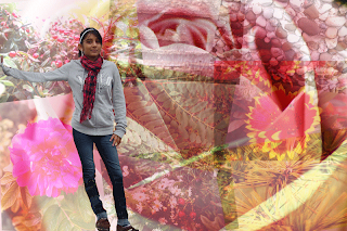
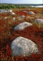
First me and my partner start off with taking a few pictures outside where there are all diffferent types of textures. We get a few pictures of flowers, trees, plants, rocks and earthly objects. Then by saving them on the computer i choose the best ones for my textural collage. Then i go on the lci comm tech blog and read the article and intrustions that our teacher has left for us. So then i start off by opening photoshop and finding a backround like it said in the article that can portray the feeling of texture with. So i choose a rose from the deviant art website. I choose it because the rose petals has many layers and you can see the soft texture of the pink petals very clearly. Then i choose a picture of rocks because you can see the texture effect of the different types of rocks and then i opened it on photoshop and then by clicking on the MOVE TOOL i move the picture to the rose. When i moved the picture it turned out to be really big so i go up to EDIT then TRANSFORM then SCALE to change the size i prefferd.Then i change NORMAL to LINEAR LIGHT and change the opacity to about 44%. This is so you can see the rose and when you do that to all the pictures they can look like there blended in.Then i go back to EDIT and then go down to FREE TRANSFORM, this is so i can rotate the picture any way i want to. Then i do the same for all the other pictures. As you can see beside the rocks in the collage, is a picture of rocks as well but it was on a wall and i took it from an angle from the top, i think it protrays texture because of the rough feeling of the rocks. Then beside that picture is a picture of many berries which shows texture because of the soft surfaces of the many berries. Then there are two pictures of flowers and i thought they portraied texture because of the petals and colours. then there is a picture of a part of a pine that portraied texture becasue of the many spikes. The picture at the bottom middle of the collage represnted texture because of the flowers, berries and the shape of the leaves together. The last picture in the middle represented texture because of the overlaping of the leaves. Then for the last picture i put a picture of me, i cut myself out with the MAGNETIS LASSO then i slowly erased the parts i didnt get and then i moved it to the collage by using the MOVE TOOL and then resized to the way i wanted it and moved mayslef to the left of the page. I used the picture of myself because of the clothes i was wearing had some texture such as my scarf and jeans. Then i saved it and posted it here so anyone who reads my blog can see my collage. So here is my textural collage, hope you like it. :) sunnie 25

Thursday, October 1, 2009

photography intro

Texture can add a significant amount of interest in any picture. Texture is a good idea when you’re taking pictures of rocks, walls, surfaces, someone's hands, or leaves. Generally, the surface characters of an object, e.g. rough, or smooth. In photography, careful control of lighting can be used to describe a surface by adding an obvious quality in terms of depth, shape and tone suggesting three dimensions. In order to make a picture reveal a texture you must make sure the light is coming almost exactly from the side of the surface so it creates shadows in key places.


Linear perspective-The notion of depth given by converging parallel lines, and changes of subject scale between foreground and background elements. A lens with a focal length longer than the diagonal of the film format with which it is used.

Saturday, September 26, 2009

technique-smoke effect

The new technique that I found out was how to do the smoke effect. I tried it out and this is what it looks like compared to how it’s really supposed to look like. The technique didn't turn out the way i wanted it to turn out. I think what I did wrong was I didn’t use the highlighting enough and the burn tool. I think I should’ve used fading effects for my picture. If you like to try this technique you can visit this website at http://www.bluesfear.com/submittuts/ps/1/. Hope you like the effect.:) sunnie25

Actual picture


Thursday, September 24, 2009

Famous Photographer Erik Almas

Erik Almas is a great photographer, he has a portfolio of landscapes, life styles, fashion, portraits and fine art. He grew up in Trondheim, Norway. He moved to the U.S to study photography. He attended the Academy of art university for 4 years and h e graduated in 99 with" best portfolio" in the spring show. In 2004 they gave him an honorary degree of outstanding alumnus. He assisted Jim Erickson for about 3 years and he said that the couldn't find a better mentor. Jim inspired him and encouraged Eriks own image making and gave him a set of working habits that helped him succeed on his own.Now he is living in San Francisco where he calls home and shoots lots of pictures. His portraits are very real and sharp that you can see every detailin them. The fashion pictures look very beautiful and some looked like there unrealistic but i looks good like that. The landscapes are very beautiful and i have never seen them before, they show the high mountain ranges and it looks really cool because of the sun shining on the beautiful landscapes. Hope you like this short biography about Erik Almas,and if you want to know more about him or see some of his fine photographs you can visit this site at http://www.erikalmas.com/. Hope you like the website.:) sunnie25

Wednesday, September 23, 2009

Random Album cover 2

For my second random album cover i got a random word from wikipedia which was "Forde Forgre" and it was my band name. Then i got the last 4 words from a random quotes site which was " they cannot find it" and then i went to flickr and the third picture was a gecko so i saved it on photo shop. i used the crop tool to make the picture square like an album cover and pressed on shift while doing that.Then i put the word Ford forge at the top of the picture and made the font green and added an outer glow so it would match the mood of the picture and pop out. the i took the word "they cannot find it"and placed each word diagonally on the back of the gecko and made the letters yellow. i think the music would be more like melodious and naturalistic music. So here is my random album cover. hope you like it.:) sunnie25

Tuesday, September 22, 2009

Random Album Cover 1

For my first random album cover i went on the lci comm tech page and went on the random album cover blog and went on Wikipedia and got the name that appeared first which was "Zula Hula" and it was the name of the band. Then i went on the second link which was a quotes link and i had to get the last 4 or 5 words of the last quote which was "the image of god". Then i went to the last link which was flickr and i had to us the third picture which was of two boys skateboarding. Then i went to photoshop and saved the picture. I put the word Zula Hula on the left side of the picture vertically and the words straight down by clicking on vertical at the top of the page. Then i placed the word The image of god on the skateboard ramp and skewed it so it would look like it was actually written on the ramp and added an outer glow to the letters so they would pop out. After that i took the word Zula Hula and changed the font so it would look like it was a boys band and changed the colour to blue and the outer glow to light blue. I thought this was a soothing boys band so this is why i used thes types of fonts and colours . So here's the random album cover. hope you like it.:)sunnie25


Friday, September 18, 2009

Jonas Brothers in the Desert

Here i have a picture of the jonas brothers and i want to put them in the desert. So first i cut as much as i can around the jonas brothers using the MAGNETIC LASSO TOOL and then by taking the NORMAL LASSO TOOL i used SHIFT and ALT and made the little adjusments around them that i have missed or filled and then i went up to select and then inverse so that only they would be selected.Then by using the MOVE TOOL i pressed down shift and moved the picture to the desert. When i moved the picture it was really big and i went up to EDIT and then TRANSFORM and thesacle and made them my preffered size. then by taking the magic wand magic wand i took out the peices between them and aound them by zooming in and seeing the little pieces. After that i wanted the light to shine on the jonas brothers from the sun in the backround so i went to IMAGE then ADJUSTSMENTS and then BRIGHTNESS/CONTRAST. I put the jonas bothers in the desert because they wouldnt come in the desert with a microphone an guiter and play with no audiance or people and it is also to hot with the blazing sun. Hope you like it. :) sunnie25

Wednesday, September 16, 2009

obama at the great wall of china

On photo shop i had two pictures of Barack Obama in front of the capital state and i had to put it him in front of the great wall of china. Both of the pictures look different. For the first one i used the MAGNETIC LASSO TOOL to carve around just Obama, when i was done i went up to SELECT at the top and clicked on INVERSE so only Obama would be selected and that he would only be moved to the great wall of china. Then by clicking on the"move tool" i clicked on Obamas picture and moved him to the great wall of china.When i moved him to the great wall of china he was really big so i want on EDIT then i went on TRANSFORM and then i clicked on scale to make him smaller. I wanted the sunlight in the background to come on his face so he would look like he was in the sunlight so i went to LAYER and then on ADJUSTMENT and went to BRIGHTNESS/CONTRAST.That was my first Obama picture.

For the second picture i used the MAGNETIC LASSO TOOL to carve around Obama then i moved him to the next picture by clicking on him by the MOVE TOOL. When i moved him to the great wall of china he was really big so i went on EDIT then i went on TRANSFORM and then i clicked on SCALE and i made him smaller.I wanted to get rid of the blue halo around his head so i erased it with the eraser by zooming in and finding all the halo. Then i saved the two pictures and posted them here. Hope you like them:) sunnie25


FIRST PICTURE

Sunday, September 13, 2009

Welcome to my blog